In the previous tutorial, we learnt how to calculate AQI at a single monitor at a given time. In this tutorial, we’ll learn to plot AQIs of a city and also learn how city average AQIs are calculated. These averages are reported by news papers and also in AQI Bulletins.
2.1 Accessing real-time AQI data
The Central Pollution Control Board (CPCB) publishes AQI at every monitoring station every hour. This data can be downloaded at the NAQI portal. We’ll now work with AQI data from each station in Delhi reported at 4PM on 7th March.
import pandas as pdaqi_stations = pd.read_csv('data/AQI_all_station2026_03_07T16_00_00Z.csv') #Data downloaded and cleaned from NAQI portalaqi_stations['City'] = aqi_stations.City.ffill() # Filling Null values in City columnaqi_stations_delhi = aqi_stations[aqi_stations['City']=='Delhi'].reset_index(drop='True')aqi_stations_delhi.head()
S.No.
State
City
Station Name
Current AQI value
0
76
Delhi
Delhi
Alipur, Delhi - DPCC
256
1
77
Delhi
Delhi
Anand Vihar, Delhi - DPCC
275
2
78
Delhi
Delhi
Ashok Vihar, Delhi - DPCC
261
3
79
Delhi
Delhi
Aya Nagar, Delhi - IMD
200
4
80
Delhi
Delhi
Bawana, Delhi - DPCC
262
2.2 Plotting AQI at each station on a map
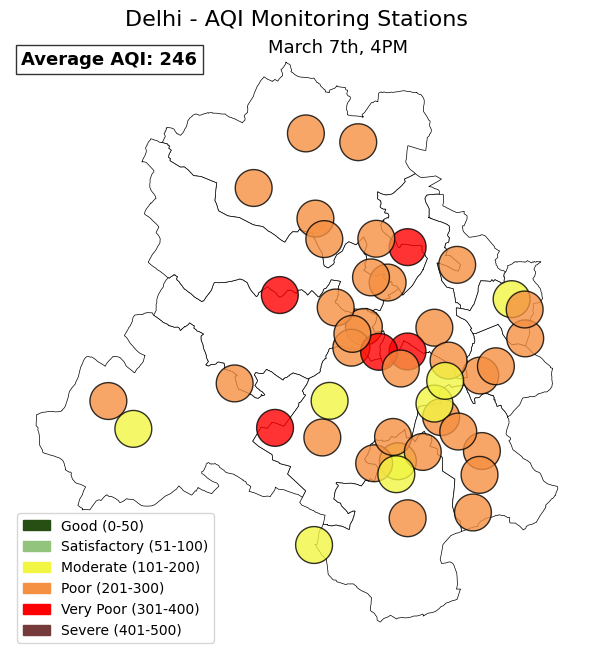
We shall thus plot the AQI at each station on a map, to find out how representative the monitoring network is.
Show hidden code that downloads lat-lons of CPCB air quality stations in Delhi
api_key =""#Generate API key from data.gov.in portal.state ='Delhi'url =f"https://api.data.gov.in/resource/3b01bcb8-0b14-4abf-b6f2-c1bfd384ba69?api-key={api_key}&format=csv&filters[state]={state}&limit=500"df = pd.read_csv(url)df[['station','latitude','longitude']].drop_duplicates().reset_index(drop=True).to_csv('data/delhi_stations_locations.csv',index=False)
#Merge Station locations dataframe with station AQI dataframeaqi_stations_delhi_locations = aqi_stations_delhi.merge(delhi_stations_locations, left_on='Station Name', right_on='station')aqi_stations_delhi_locations.head()
S.No.
State
City
Station Name
Current AQI value
station
latitude
longitude
0
76
Delhi
Delhi
Alipur, Delhi - DPCC
256
Alipur, Delhi - DPCC
28.815329
77.153010
1
77
Delhi
Delhi
Anand Vihar, Delhi - DPCC
275
Anand Vihar, Delhi - DPCC
28.647622
77.315809
2
78
Delhi
Delhi
Ashok Vihar, Delhi - DPCC
261
Ashok Vihar, Delhi - DPCC
28.695381
77.181665
3
79
Delhi
Delhi
Aya Nagar, Delhi - IMD
200
Aya Nagar, Delhi - IMD
28.470691
77.109936
4
80
Delhi
Delhi
Bawana, Delhi - DPCC
262
Bawana, Delhi - DPCC
28.776200
77.051074
# Convert this latitudes and longitudes into GeoDataFrame using geopandasimport geopandas as gpdaqi_stations_delhi_gdf = gpd.GeoDataFrame( aqi_stations_delhi_locations, geometry=gpd.points_from_xy(aqi_stations_delhi_locations.longitude, aqi_stations_delhi_locations.latitude), crs="EPSG:4326")aqi_stations_delhi_gdf.head()
#Assign colors to each AQI station based on the AQI valueaqi_stations_delhi_gdf["Current AQI value"] = pd.to_numeric(aqi_stations_delhi_gdf['Current AQI value'], errors='coerce')aqi_stations_delhi_gdf["color"] = aqi_stations_delhi_gdf["Current AQI value"].apply(aqi_color)
In the above plot, Delhi’s average AQI at 4PM on March 7th is reported as 246. The CPCB reports the average of all functioning monitoring stations’ AQI, at a given time, as the city average AQI.
valid_aqis = pd.to_numeric(aqi_stations_delhi['Current AQI value'], errors='coerce')num_monitors = valid_aqis.dropna().shape[0]total_monitors = aqi_stations_delhi.shape[0]print(f'Total number of monitors: {total_monitors}\n Number of monitors with AQI data: {num_monitors}')
Total number of monitors: 46
 Number of monitors with AQI data: 45
We have AQI data from 45 stations at 4PM on March 7th. The average of these 45 AQIs is reported at city average AQI.
mean_aqi =round(valid_aqis.mean())print(f'The average AQI in Delhi on March 7th 4PM is: {mean_aqi}\n It is calculated using AQIs from {num_monitors}/{total_monitors} monitors')
The average AQI in Delhi on March 7th 4PM is: 246
 It is calculated using AQIs from 45/46 monitors
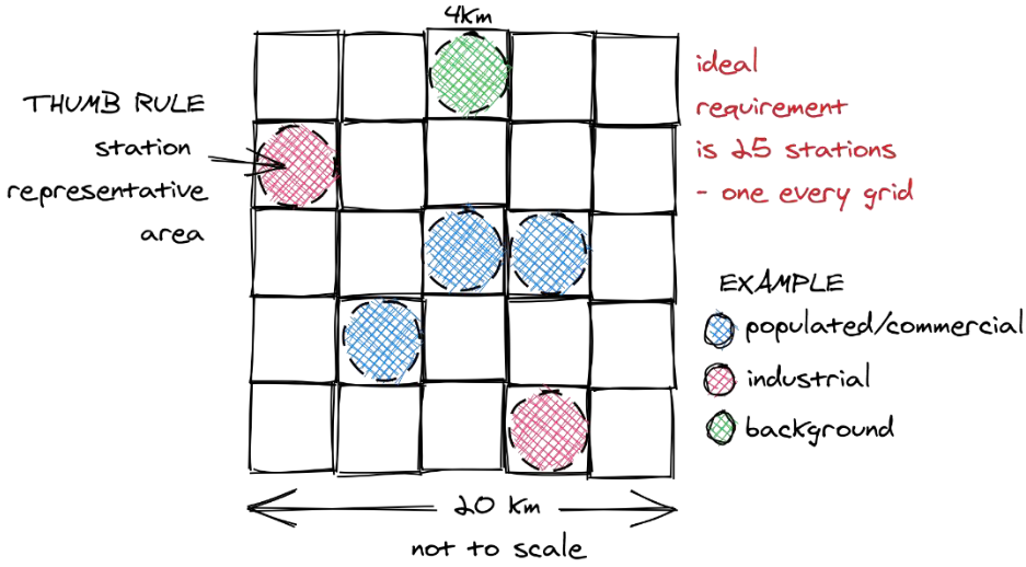
However, there is an important nuance that goes missing while reporting the average AQI of a city alone. A monitoring station gives information of air quality for an area of ~10 sq.km. We’ve seen above, how even a city like Delhi, which has the densest monitoring network in India, has large parts of it under-represented. Other cities have even smaller networks and thus are even less spatially represented.
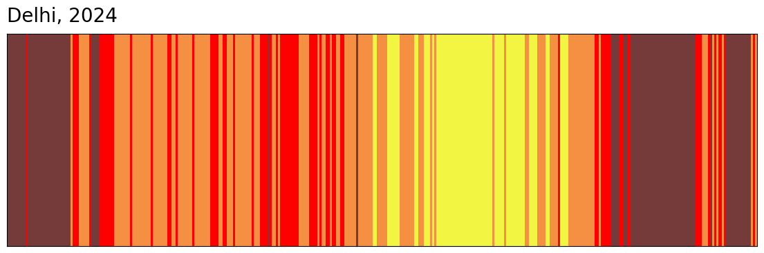
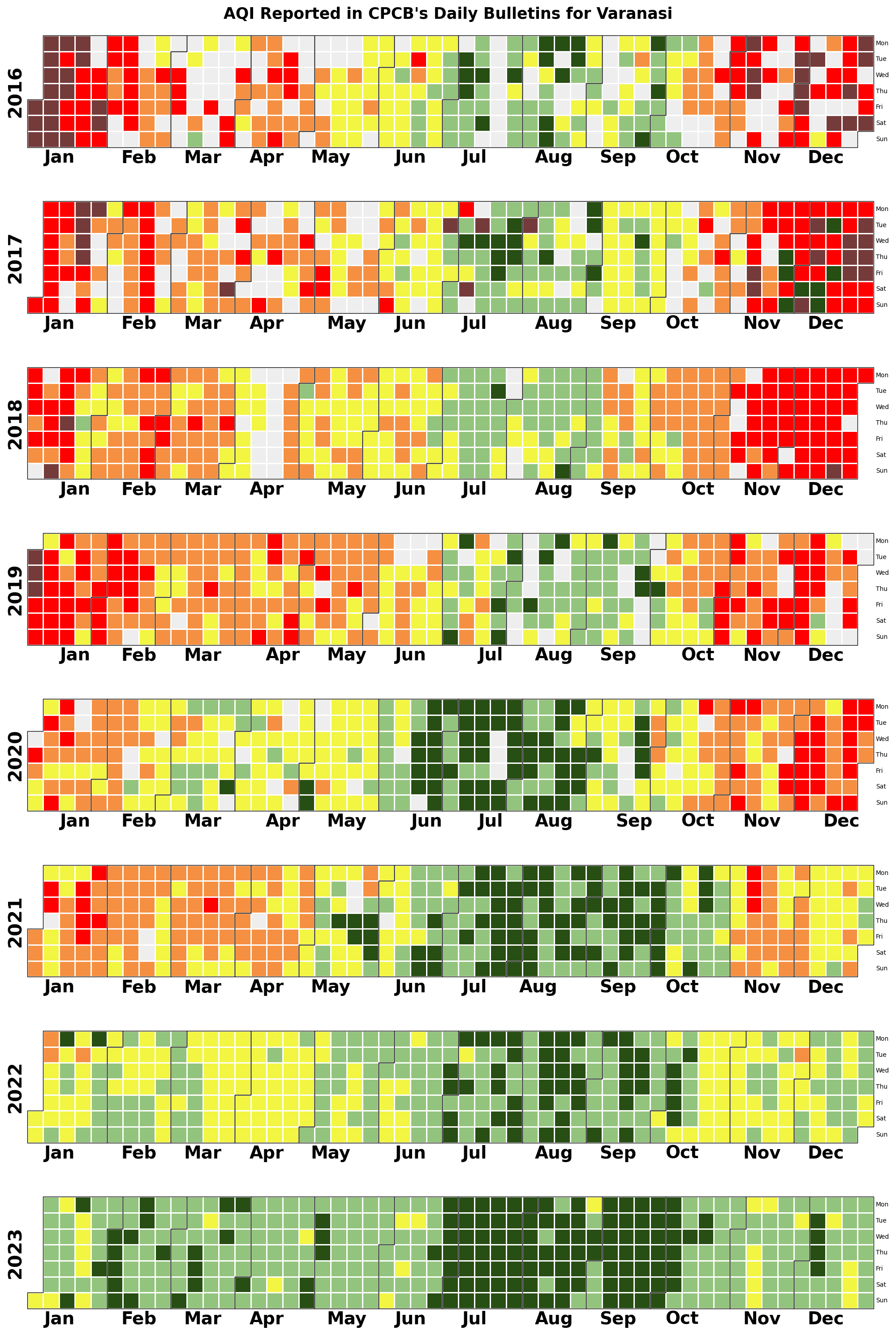
CPCB reports daily the city average AQI of every city in its AQI Bulletins. Urban Emissions cleaned this data from 2015-2025. This data can be used to tell interesting visual stories of a city’s air pollution. Urban Emissions has another dedicated set of tutorials on creating Air Quality Visuals