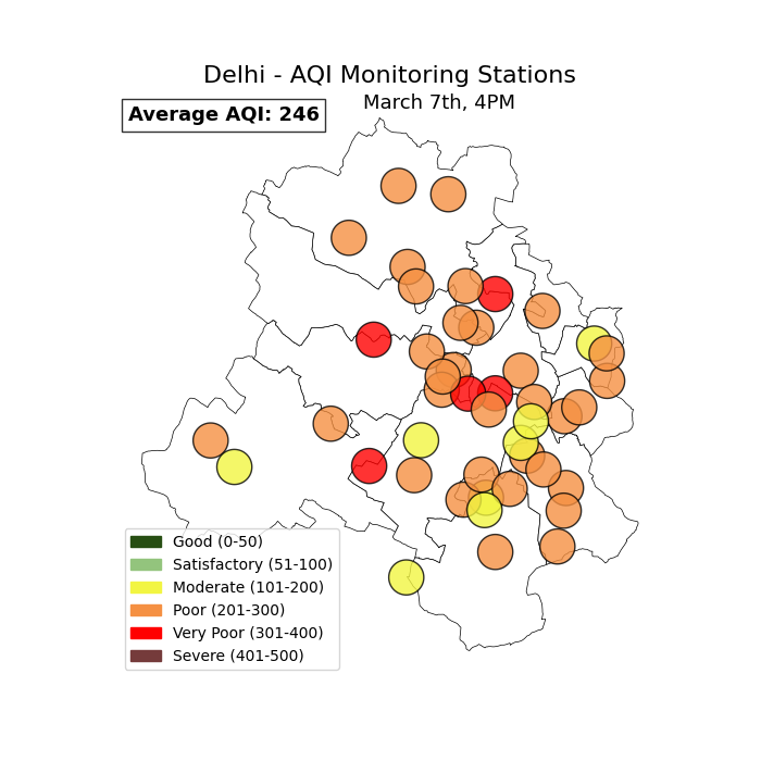
In the previous tutorials we discussed the issue of monitoring data spatially under-representing a city. We specifically saw how Delhi, with India’s densest monitoring network, covers only 35% of its geographical area. In this tutorial we’ll learn how to fill gaps. There are several methods to fill these gaps. We’ll use satellite images from SENTINEL-5P TROPOMI Sensor to fill gaps in this tutorial. We’ll also learn about limitations of this method.
4.1 About TROPOMI
TROPOspheric Monitoring Instrument (TROPOMI) is a sensor aboard a satellite part of the European Space Agency’s Sentinel-5P mission. The primary goal of TROPOMI is to provide daily global observations of key atmospheric constituents related to monitoring and forecasting air quality, the ozone layer, and climate change.
The two crucial parameters to note when working with a satellite data are spatial resolution and temporal resolution.
TROPOMI has daily observations of several pollutants like NO2, O3, CO, HCHO and SO2. The temporal resolution is thus: 24 hours.
spatial resolution is simply the size of the pixel in the stallite image. TROPOMI’s images has a pixel size of ~3.5 x 5.5 km.
4.2 Downloading TROPOMI images from the source
There are many satellite data providers who improve upon the basic TROPOMI layers. We’ll start with learning how to get TROPOMI images from the source: Copernicus dataspace. It is recommended to login to use all features of the portal.
We’ll download NO2 pollutant image. NO2 pollutant is more reliable than other pollutants from TROPOMI. NO2 has a lifetime of about a day. TROPOMI gives one picture of any region per day. So, each day’s NO2 measurement can be interpreted as pollution on that day.
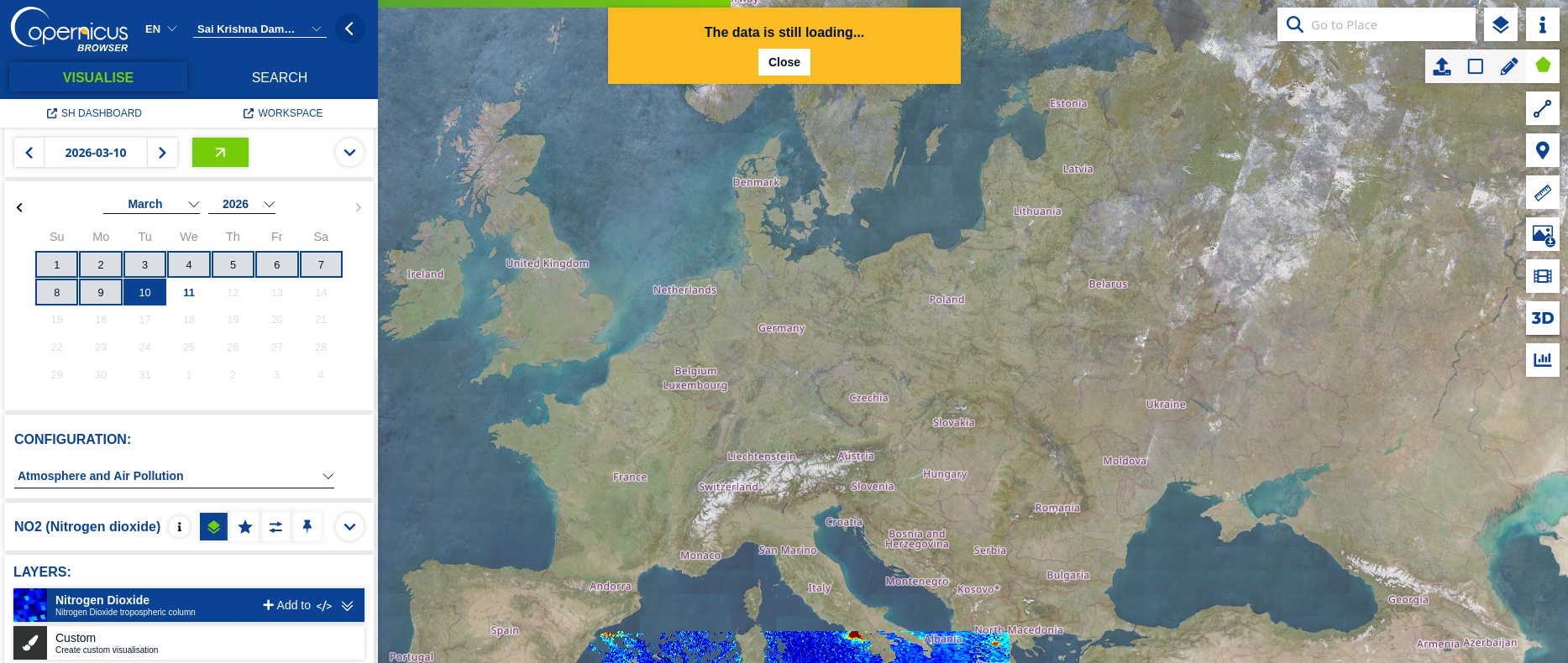
After logging into to the [Copernicus dataspace], it is straight forward to download NO2 pollutant image.
On the left panel: 1. Select the day 2. Select Configuration as Atmosphere and Air Pollution 3. Choose NO2 Layer
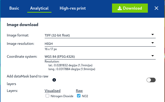
On the right panel: 1. Create an area of interest. You can either draw directly on the map, or upload airshed’s polygon in the form of KML or GEOJSON file. For this tutorial, I uploaded the Delhi state boundary. 2. Click on download. You can download the image in Basic JPG/PNG formats or in Analytical TIF formats. TIF images can be analysed using geospatial softwares like QGIS, rasterio etc.
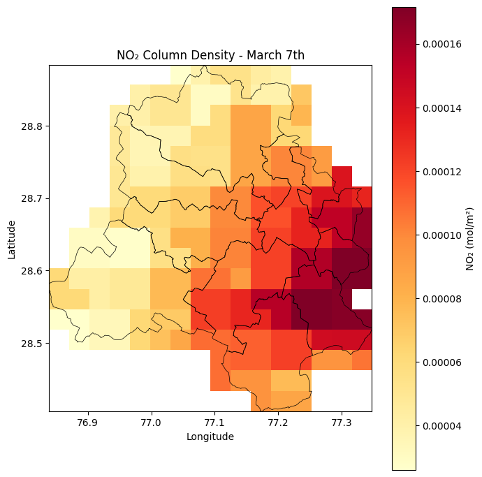
Raw NO2 are the pixel level measurement of NO2. TROPOMI uses a unit of mol/m2. We’ll use the Raw NO2 file to plot the satellite image of Delhi. This visualisation is also part of our Air Quality Visuals Course: Plotting Satellite images
Show hidden code that plots the Raw NO2 TIFF file
import rasterioimport numpy as npimport matplotlib.pyplot as pltimport matplotlib.colors as mcolorsfrom rasterio.plot import showimport geopandas as gpd# Load TIFFtif_path ="data/2026-03-07-00_00_2026-03-07-23_59_Sentinel-5P_NO2_NO2_(Raw).tiff"with rasterio.open(tif_path) as src: no2 = src.read(1) # first band no2 = np.where(no2 == src.nodata, np.nan, no2) # mask nodata extent = [src.bounds.left, src.bounds.right, src.bounds.bottom, src.bounds.top] crs = src.crs# Load admin boundaries — reproject to match raster CRSdelhi_districts = gpd.read_file('data/DELHI_DISTRICTS.geojson').to_crs(crs)delhi_districts.head()# Plotfig, ax = plt.subplots(figsize=(7, 7))im = ax.imshow( no2, extent=extent, cmap='YlOrRd', origin='upper', vmin=np.nanpercentile(no2, 2), # clip outliers vmax=np.nanpercentile(no2, 98),)# Admin boundary overlaydelhi_districts.boundary.plot(ax=ax, linewidth=0.5, color='black')plt.colorbar(im, ax=ax, label='NO₂ (mol/m²)')ax.set_title('NO₂ Column Density - March 7th')ax.set_xlabel('Longitude')ax.set_ylabel('Latitude')plt.tight_layout()#plt.savefig('no2_map.png', dpi=150, bbox_inches='tight')plt.show()
Thus we have filled the gaps in NO2 monitoring using TROPOMI’s NO2 data in Delhi.
4.3 Limitations of Satellite images
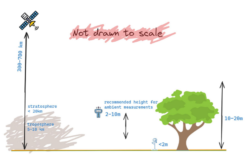
satellite.png
While satellite images help us get pollutant concentration in areas where there are no monitoring stations, there are a few limitations in relying completely on satellite images alone:
Satellite images give the value for the entire vertical column above the ground, while we are generally interested in the ambient measurements (2-10m height), where we breathe air.
Nevertheless, combining satellite data with ground-monitoring data and modelling data allows us to get a better understanding of air quality in a city.
4.4 Summary
In this tutorial, we learnt that a city’s air quality monitoring network alone would result in a lot of gaps spatially. We then learnt to fill these gaps using satellite images - that of TROPOMI. We also learnt the limitations of satellite images.